Kolenko & Associates
Summary
Client Kolenko & Associates
Date Client since 2022
Scope Branding, Graphic Design, Logo Design, Social Media Marketing, Website Development, Business Card Design and Printing with custom die cut, Letterhead Template Design, No. 10 Envelope Design
Website kolenkoassociates.com
Twitter twitter.com/kkolenko
Linkedin linkedin.com/in/kolenkok
Strategy
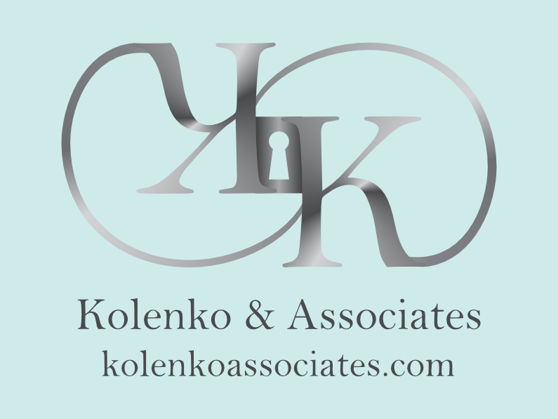
When Kolenko & Associates, a seasoned Silicon Valley company, with over 25 years in Sales and Marketing to the fortune 1000, financial, retail, and healthcare industries approached us for strategic branding, we were honored. As a high profile business, your brand needs to be on target! The request was to make a simple logo with the letter K in a circle…..well, that’s not how we roll. There needs to be symbolism in every logo supporting the brand’s message. We developed a brand strategy that included a unique, powerful logo. The logo design representing cybersecurity and real estate with a lock exemplifies the Kolenko & Associates brand with meaning. An infinity symbol joined by the letter K represents a never ending connection and loyalty to their clients. While the metal silver represents strength, the light teal represents calm. The strategic brand also includes the redevelopment of the website, social media marketing, a one of a kind business card, letterhead and more.
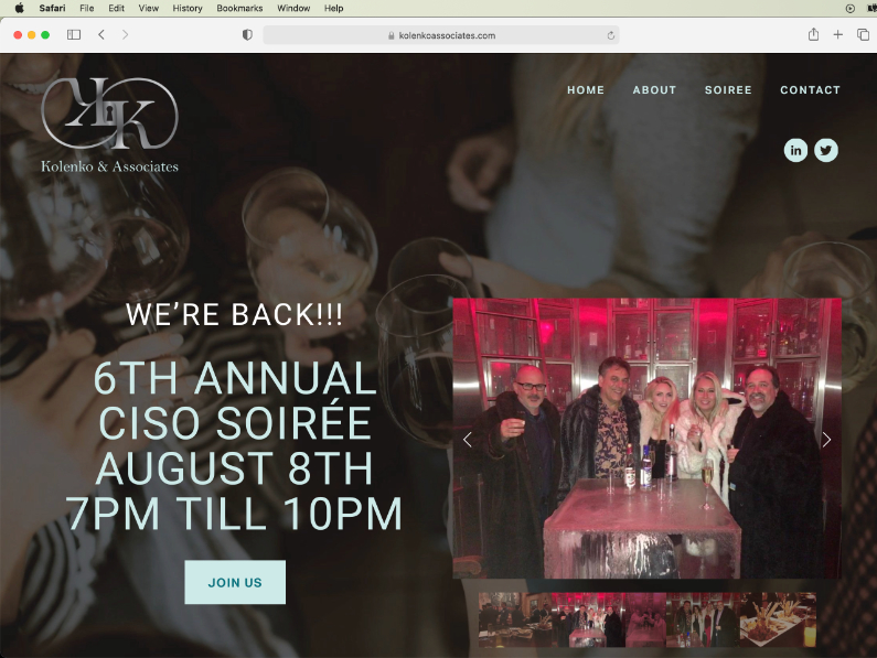
kolenkoassociates.com Website Design, Development and Support
Kolenko and Associates had a website, but it was not up to par. We redeveloped the site to reflect the new brand with a powerful logo, color scheme, social media links, new content and much more. Now it reflects a professional site that is on target for a seasoned Silicon Valley executive.
Kolenko & Associates Social Media Marketing
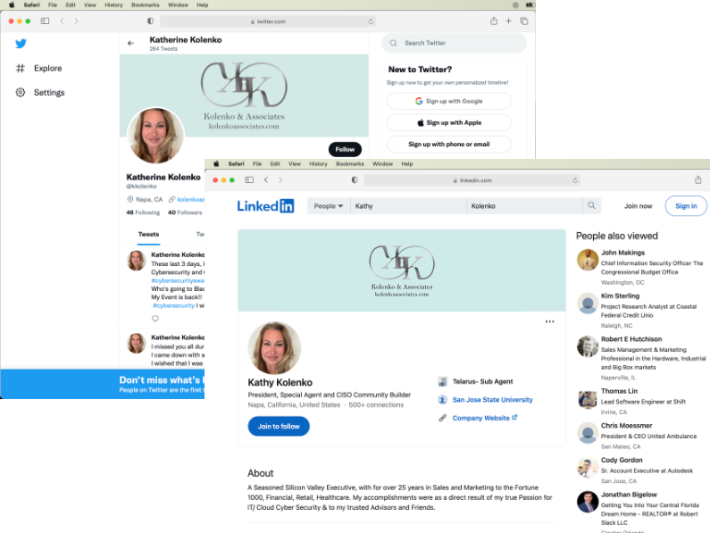
Along with an awesome new website, we developed a social media marketing strategy. We branded Kolenko & Associates on Linkedin and Twitter.
Kolenko & Associates Business Card
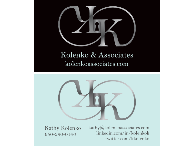
“Brilliant idea! Yes I want the key hole die cut in the business card!” stated Kathy Kolenko when we explained the business card design. The logo design representing cybersecurity and real estate with a lock exemplifies the Kolenko & Associates brand with meaning. An infinity symbol joined by the letter K represents a never ending connection and loyalty to their clients. While the metal silver represents strength, the light teal represents calm.
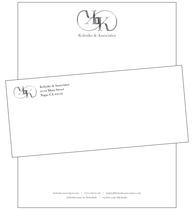
Kolenko & Associates Letterhead Template and No. 10 Envelope Design
We designed a letterhead template and No. 10 envelope reflecting the new brand exuding professionalism with an inviting clean look and feel.
